If you haven't done so already, go get yourself a trial version of IconForge either from their site or from Favicon.com. Once you've finished downloading, follow the
directions for installation. Done already? Open that puppy up!
Okay, what next? Since you probably don't have a clue as to where to
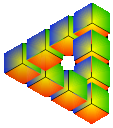
start, I'm going to walk you through how to make an icon that looks like
this:
Isn't it lovely? We're not going to go
over all the tools in-depth for the sake of brevity (there are some pretty
awesome features, so dig deeper), but this pretty little icon is going to
involve some effort.
Once you've loaded up IconForge, the first step is to select how many
resolutions, or "sizes," you want in your icon to support.
The default Explorer icon to the left is 32x32 pixels
square and is set to show up to 256 colors (8-bit). Most people, however,
use a 16x16 pixel icon with 16 color support (4-bit) — you know, more
compatibility for lesser-quality
hardware that may have trouble displaying 8-bit graphics.
Either way you go, if you only pick one resolution, your final icon will
squish down into the favorites list and expand on the desktop. Unfortunately, this creates potential for some fearsome ugliness. For an expert view on the perils of resizing images, take a peek at this slice of Jason's site optimization tutorial. To keep your image from smudging when it resizes, we're going to make a multi-resolution icon. A larger version of the icon will appear when a high-resolution icon is needed, and a smaller icon will appear when the smaller version is called for.
Not sure about this resolution stuff? Let me pull out that techno-babble
dictionary again, so you can see what I'm talking about. Oh, hey, they even
included a chart!
COLORS to BIT to RESOLUTION
Now that we've successfully absorbed some more life-changing knowledge, it's
on to the easy stuff! So say a little prayer to the pixel diety of your
choice, and ask her to not let us go nutty while working on this thing.
Amen.
next page»


