The previous version of this tutorial concluded its coverage of image optimization by suggesting you grab a demo of GraphicConverter, Photoshop, ImageReady, or Fireworks and experiment with compression. Try a bunch of different settings and see what you liked best in terms of display quality and file size. By all means, do that! Our advice hasn't changed in that department. This time around, though, we're going to get our hands a little dirtier. We're going to delve into a little more compression theory, and finish up with some new optimization techniques that have become available in the more recent versions of Adobe Photoshop.
JPEG offers the widest range of compression levels, technically speaking, but it's pretty intuitive: The more you compress an image, the worse it looks. Image-editing programs generally offer Low, Medium, and High options for image quality. Photoshop 7 and Fireworks MX let the user twist the compression dial anywhere between levels 1 and 100. (Yes, and Spinal Tap's Nigel Tufnel would be impressed — but may we suggest a level 101?) Avoid the extremes, obviously, but determining the right level of compression on a given photograph is ultimately up to you.
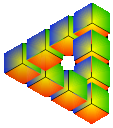
You can't variably compress GIFs or PNGs per se, but you are able to reduce their color bit depth, which limits the number of colors used. To calculate the number of colors at a given bit depth, take 2 to the power of the bit depth (i.e., 8-bit color = 256 colors). The fewer the colors, the smaller the kilobyte size of the image. Say you're building the Coca-Cola website — you can probably reduce your logo to a bit depth of 2 or 3. 2-bit color allows you a bold red and a white, but 3-bits buys you a few extra shades of each to smooth out rough edges. Speaking of extra shades, optimization pros will notice that using anti-aliased text in graphics makes it much harder to lower image bit depths. The anti-aliasing effect requires many extra colors to give text that softer look. If you must use type in your images, keeping it plain helps shrink file sizes and makes the text easier to read.


Above: 2-bit and 8-bit versions of the same image. If you don't need an extended range of colors, there's no need to use higher bit depths!
next page»